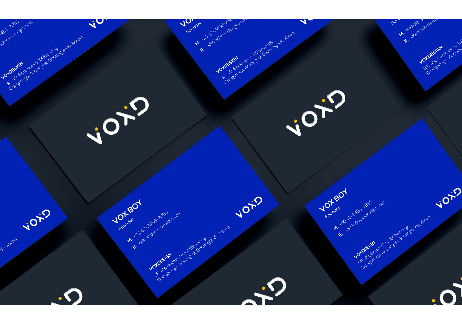
VOX Design
Brand Identity, Design Guidelines
VOX Design
VOX Design
Logo | Brand Identity | Stationery | Brand Stuff
KO-KR
복스디자인은 소비자가 경험할 수 있는 최상의 가치를 제시하는 디자인 프로젝트 그룹입니다.
반복되는 지루한 일상을 벗어나고 싶은 모든 사람들의 목소리를 담아 우리만의 이야기로 일상의 변화를 추구합니다.
반복되는 지루한 일상을 벗어나고 싶은 모든 사람들의 목소리를 담아 우리만의 이야기로 일상의 변화를 추구합니다.
EN-US
VOX Design is a design project group that presents the best value that consumers can experience.
We pursue changes in daily life with our own stories containing the voices of everyone who wants to escape from the repetitive boring routine.
We pursue changes in daily life with our own stories containing the voices of everyone who wants to escape from the repetitive boring routine.
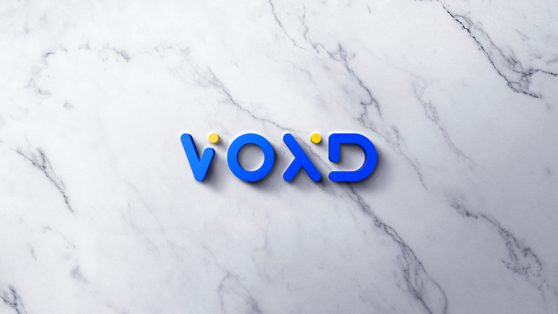
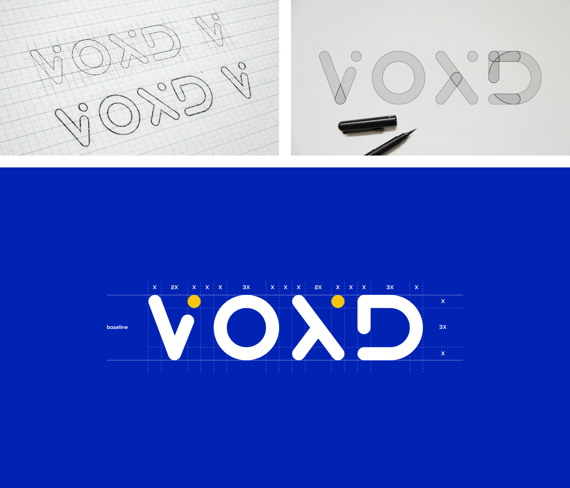
VOX Design Logotype
KO-KR
이 로고 타입은 복스디자인의 비주얼 커뮤니케이션 시스템의 핵심 요소입니다. 모든 복스디자인의 시각적 커뮤니케이션 에서 서명 장치 및 디자인 요소로 일관되고 반복적으로 사용됩니다. 로고 타입은 에이전시를 식별하고 그 활동, 업적 및 목표를 상징적으로 표현하는 시각적 약자가 됩니다.
EN-US
This logotype is the central element in VOX Design's visual communication system. Through consistent and repetitive use as a signature device and design element in all of VOX Design's visual communications. The logotype becomes a visual shorthand which identities the agency and symbolically embodies its activities, achievements and goal.
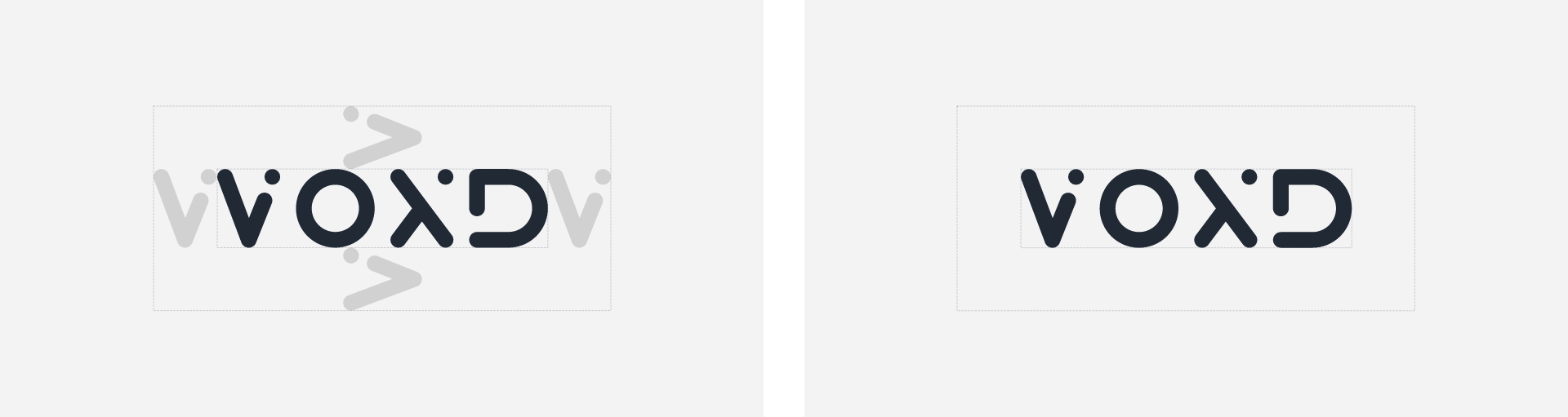
Clearing Space
KO-KR
로고의 최소 여백은 VOXD에서 V의 너비입니다.
EN-US
The minimum clear space of the logo is the width of the V in VOXD.
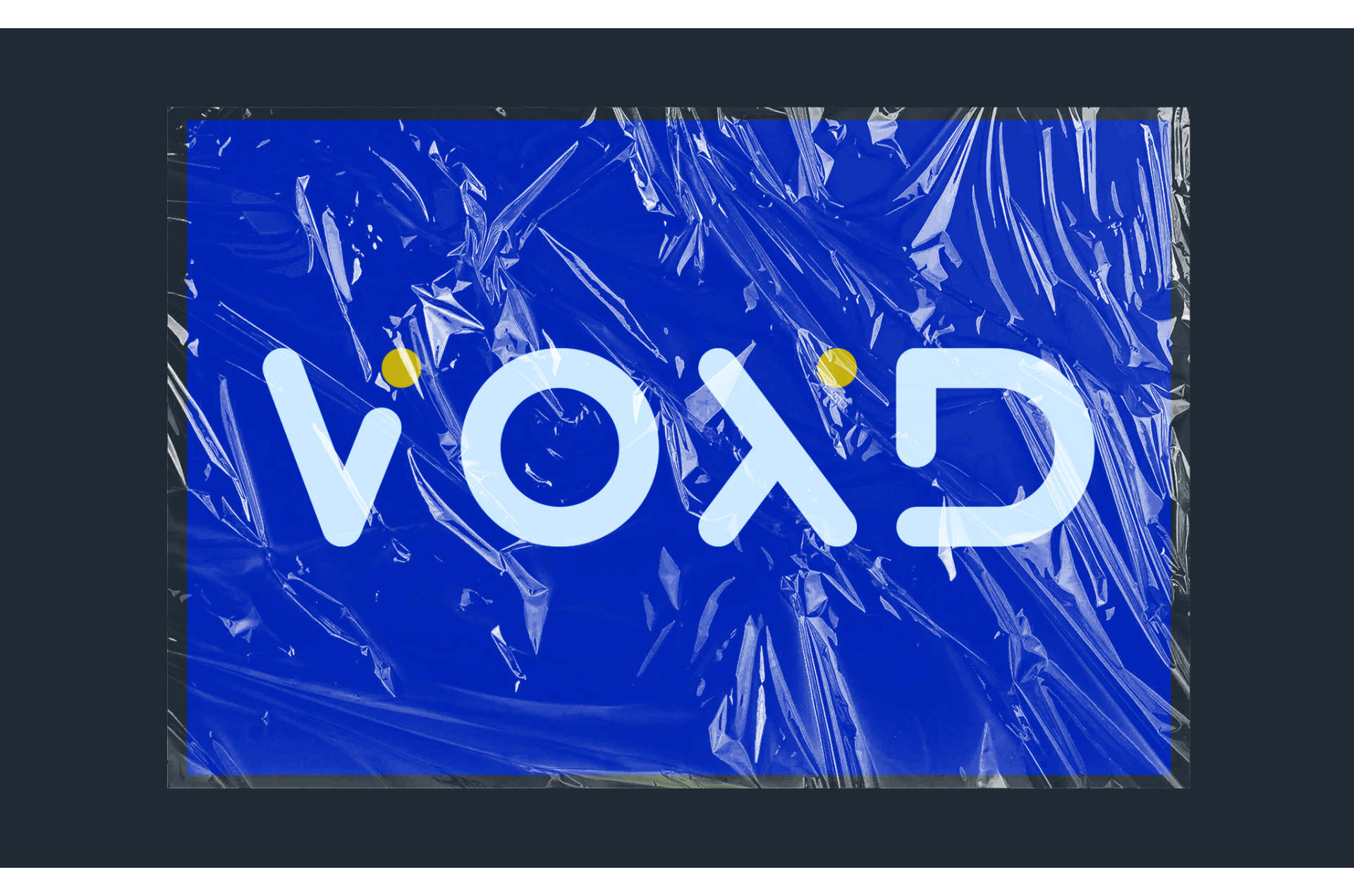
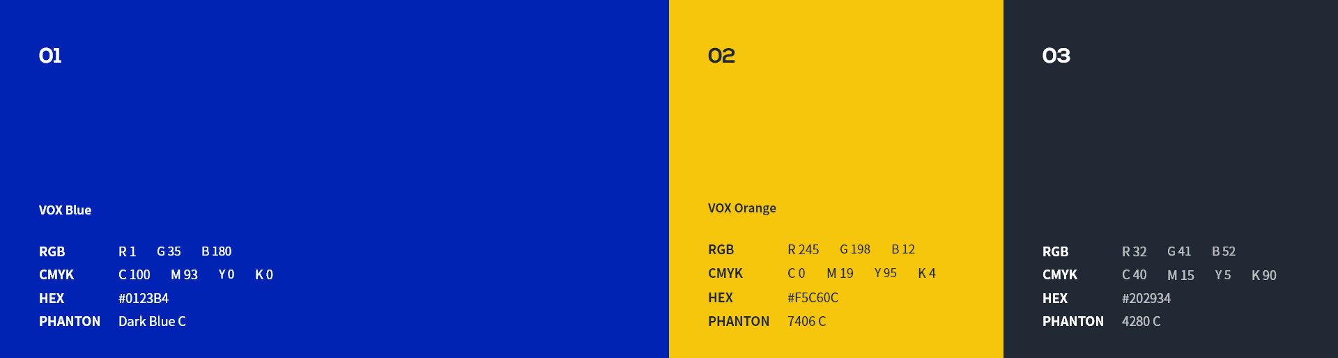
VOX Design Color
KO-KR
복스디자인 로고에 사용하기 위한 올바른 색상은 아래와 같습니다. 이 블루색은 매우 신뢰감 있는 색상입니다. 복스 블루는 색상이 유용하고 적절한 경우에만 사용해야 합니다. 흰색 배경에만 사용하도록 되어 있습니다. 명시된 색상 이외에 다른 색상, 그라데이션이나 패턴 배경 위에는 사용하면 안 됩니다.
EN-US
The correct color for use in the VOX Design logotype is shown below. This blue color is a very reliable color. VOX blue should be used only when the color is useful and appropriate. It is intended for use only on white backgrounds. Do not use over any other color, gradient or pattern background.

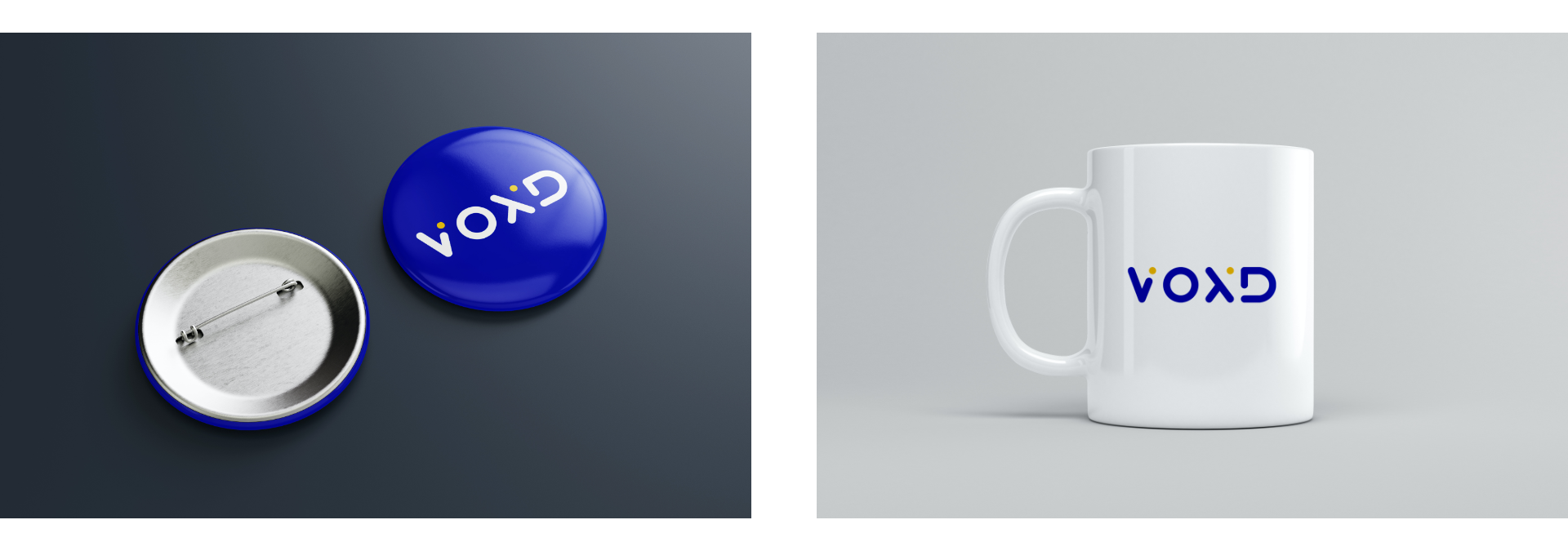
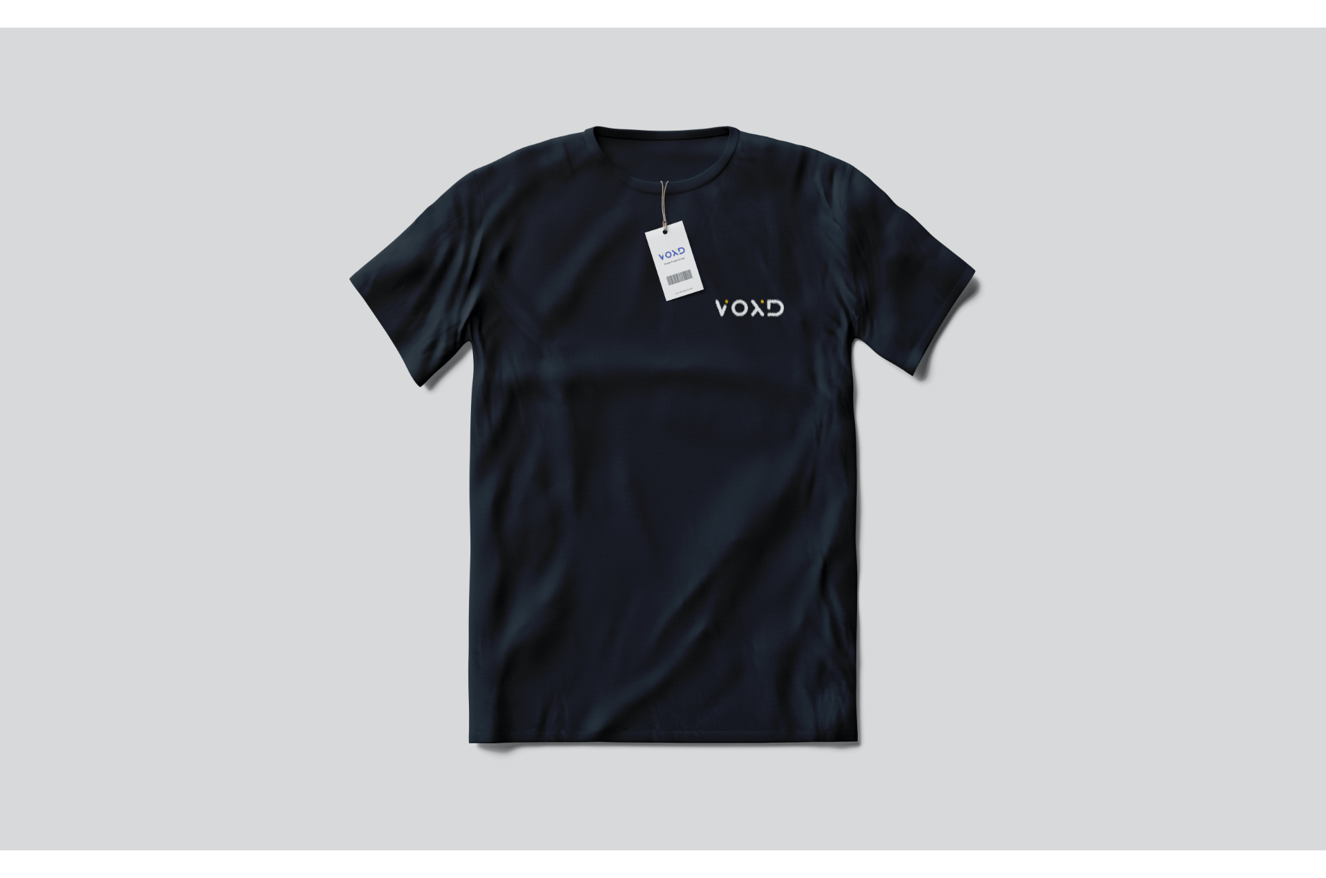
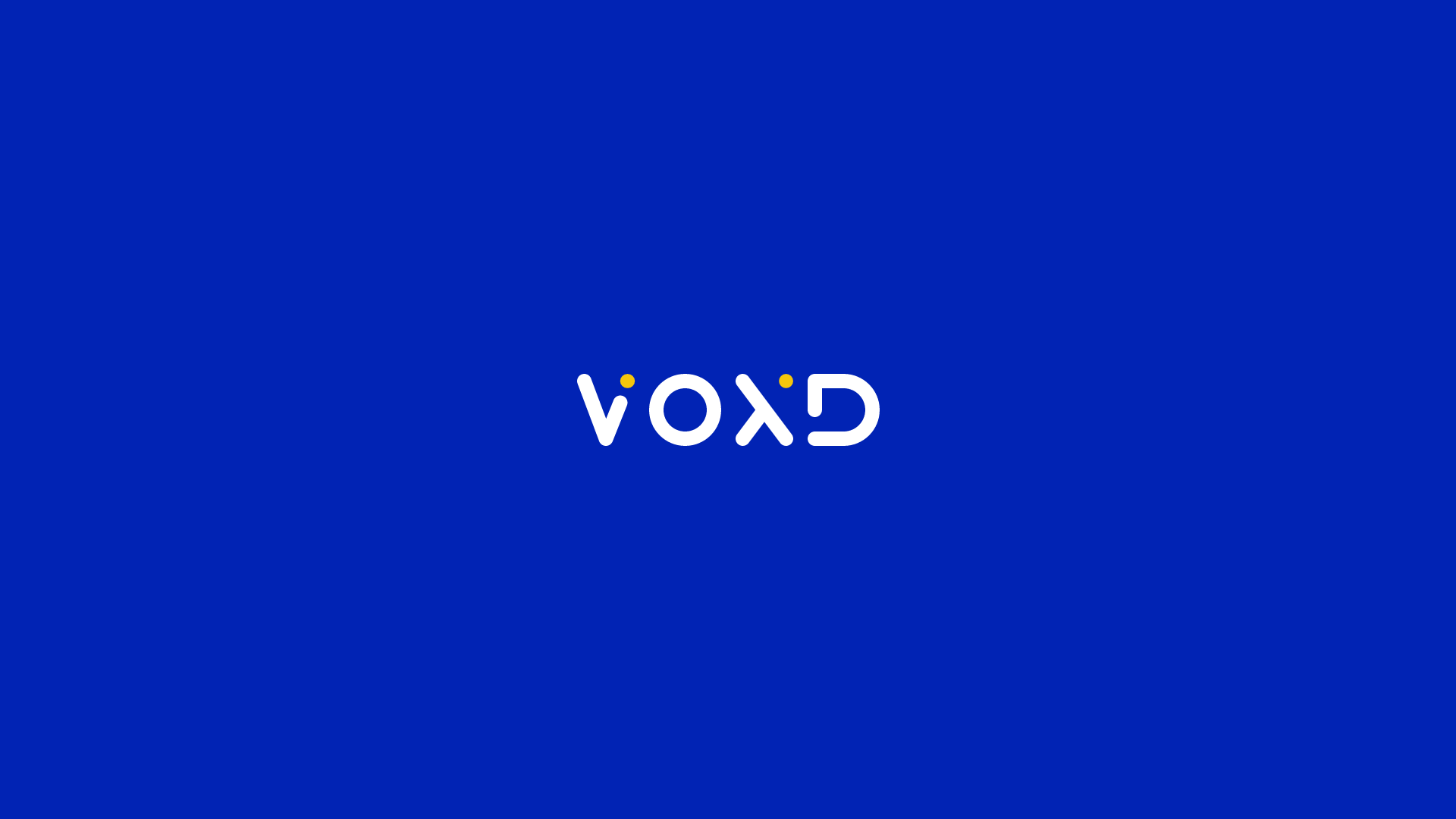
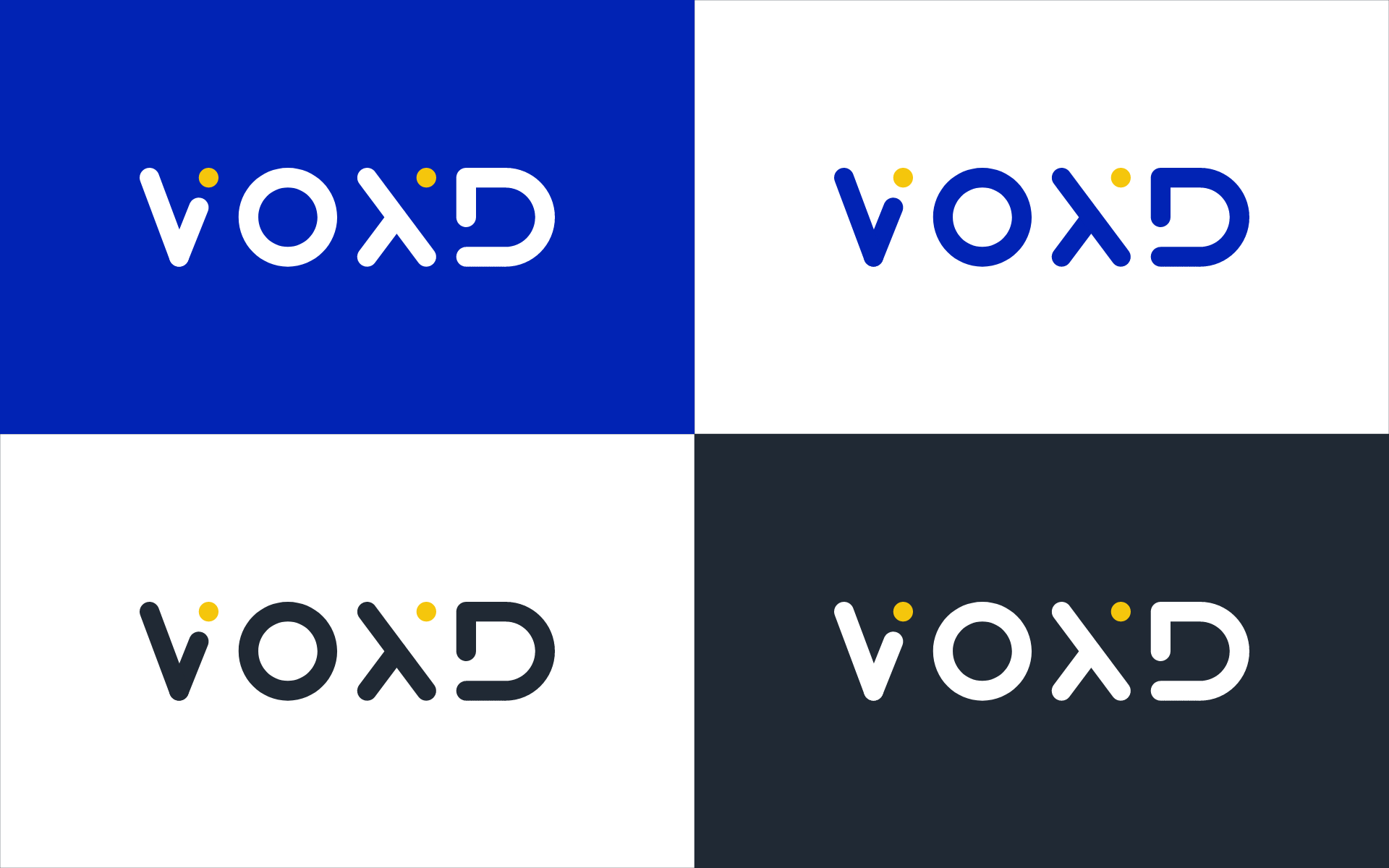
Logotype : Use of Color
KO-KR
복스 블루, 화이트, 블랙 버전의 로고를 다양한 상황에 맞춰서 사용할 수 있습니다. 화이트 로고는 반드시 복스 블루, 블랙 배경에만 사용해야 합니다.
EN-US
Vox blue, white and black versions of the logo can be used in various situations. The white logo must only be used on a vox blue, black background.
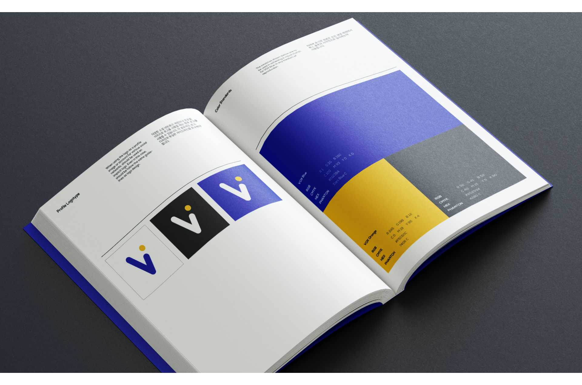
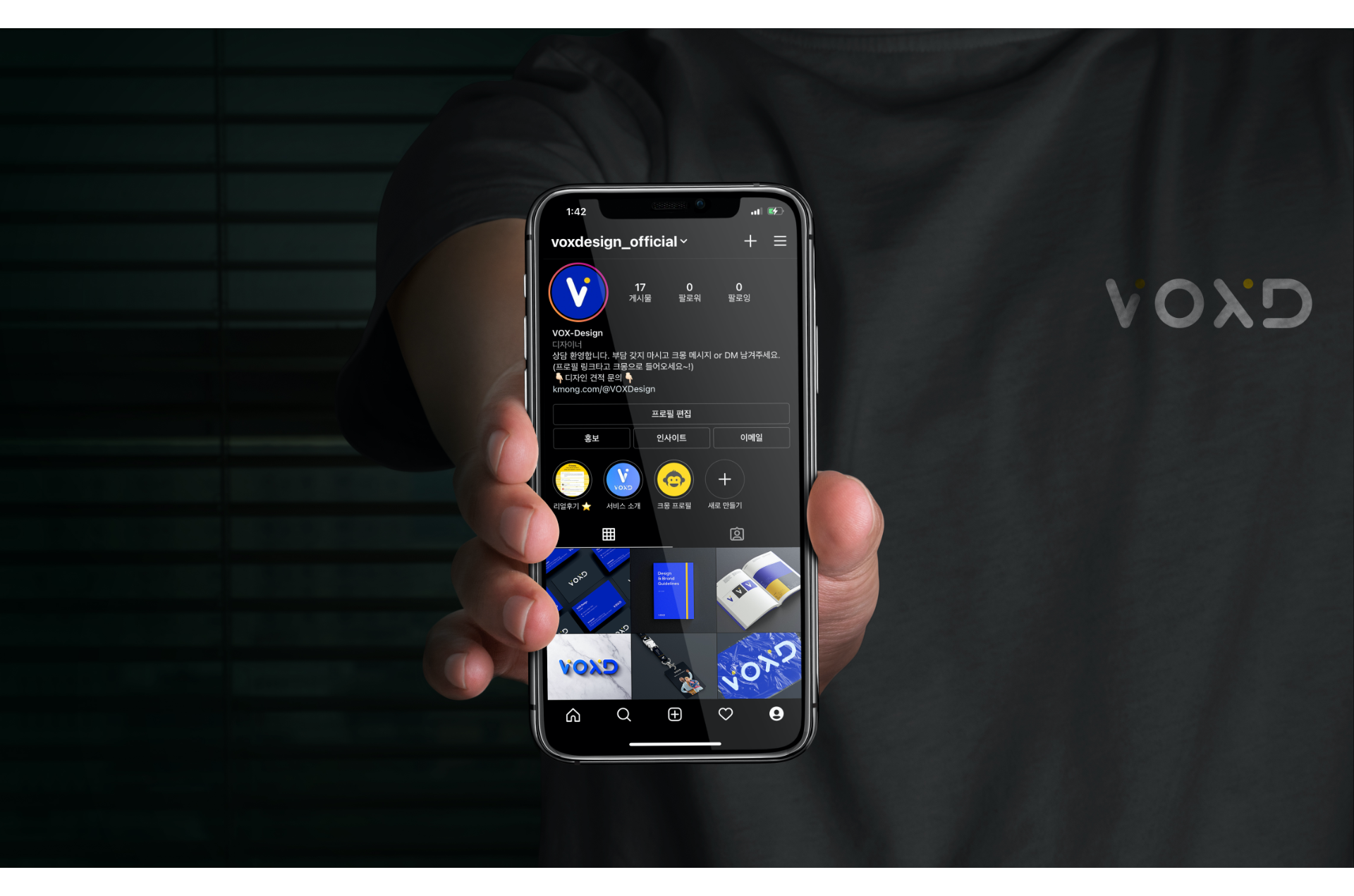
Profile Logotype
KO-KR
다양한 소셜 네트워크 계정이나 프로필 이미지로 로고를 사용할 때는 함축 로고를 사용할 수 있습니다. 이 경우에도 로고 디자인과 동일한 가이드라인을 준수해야 합니다.
EN-US
When using the logo as a profile image or account for various social networks, should be used an implicit logo. Even in this case, should be follow the same guidelines as logo design.

Color Standards
KO-KR
아래에 표시된 견본은 모든 재생 매체에서 복스 블루와 시각적으로 일치하는데 사용됩니다.
EN-US
The swatches shown below are to be used in achieving a visual match for VOX blue in any medium of reproduction.
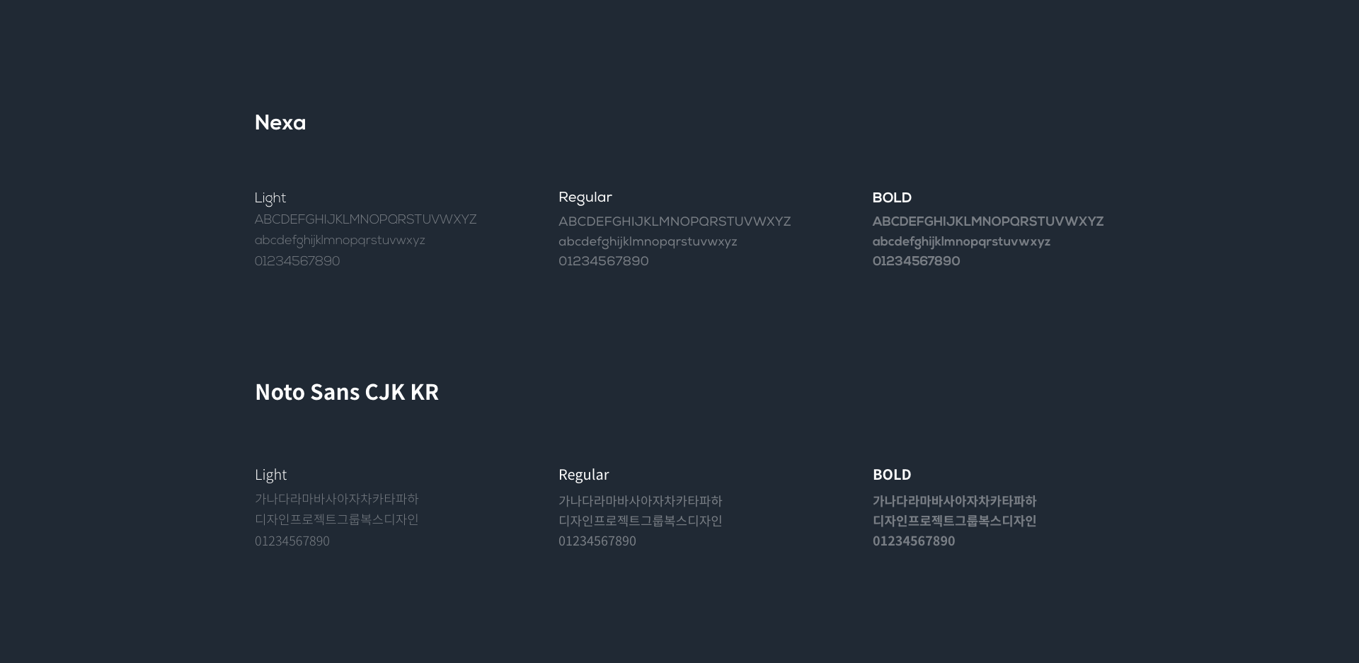
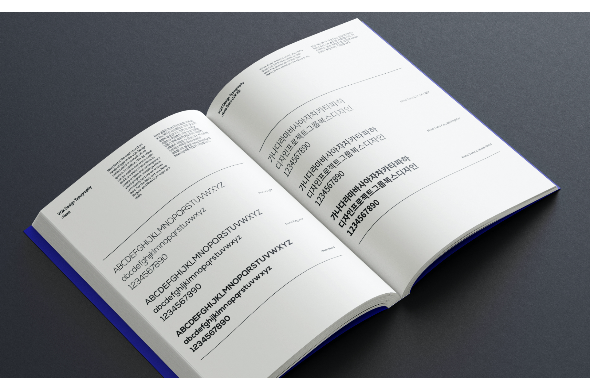
VOX Design Typography
KO-KR
Nexa 글꼴은 복스디자인 통합 비주얼 커뮤니케이션 시스템에서 가장 중요한 유형의 글꼴입니다. 또한 이 서체는 깨끗하고 현대적인 시각 프로그램을 만들기 위해 다양한 미디어와 다양한 상황에서 사용할 수 있습니다. 텍스트에 수반되는 제목은 Nexa Bold로 설정됩니다. 본문은 Nexa Regular와 Nexa Light를 적절히 사용합니다. 한글 텍스트가 사용되는 경우엔 Noto Sans CJK KR 폰트를 사용합니다. 이 경우에도 폰트의 성격은 Nexa 폰트와 동일하게 사용합니다.
EN-US
Nexa font is the most important family of type in the VOX Design unified visual communications system. In addition, this typeface can be used in numerous media and in a variety of situations to create a clean and contemporary visual program. Headings which accompany text are set in Nexa Bold. For the body text, use Nexa Regular and Nexa Light appropriately. When Korean text is used, the Noto Sans CJK KR font is used. In this case, the character of the font family is the same as the Nexa font.